


038. Using Art to Choose Colour Palettes You Love
From one tapestry to ten different colour palettes

Choosing colour palettes can be tricky - both for our homes and our wardrobes. Using art work you love can be a helpful shortcut in identifying a group of colours that make your eyes sing! In my piece, #030. The Colours of Barcelona, I shared this beautiful palette made with colours from one of Picasso’s paintings in his series entitled ‘The Pigeons’:
I love this colour palette and find it extremely alluring, but it’s more muted than I would tend to create on my own. Without seeing Picasso’s painting, I would not have thought that such a toned down palette would be so attractive to me.
Art work that we see in the world or that we already have on display in our homes can be wonderful sources of inspiration for joyously unexpected combinations of colours. And one piece of art can generate many different colour combinations that you can use to choose colours for your walls, furnishings, and accessories - or for putting together a great outfit.
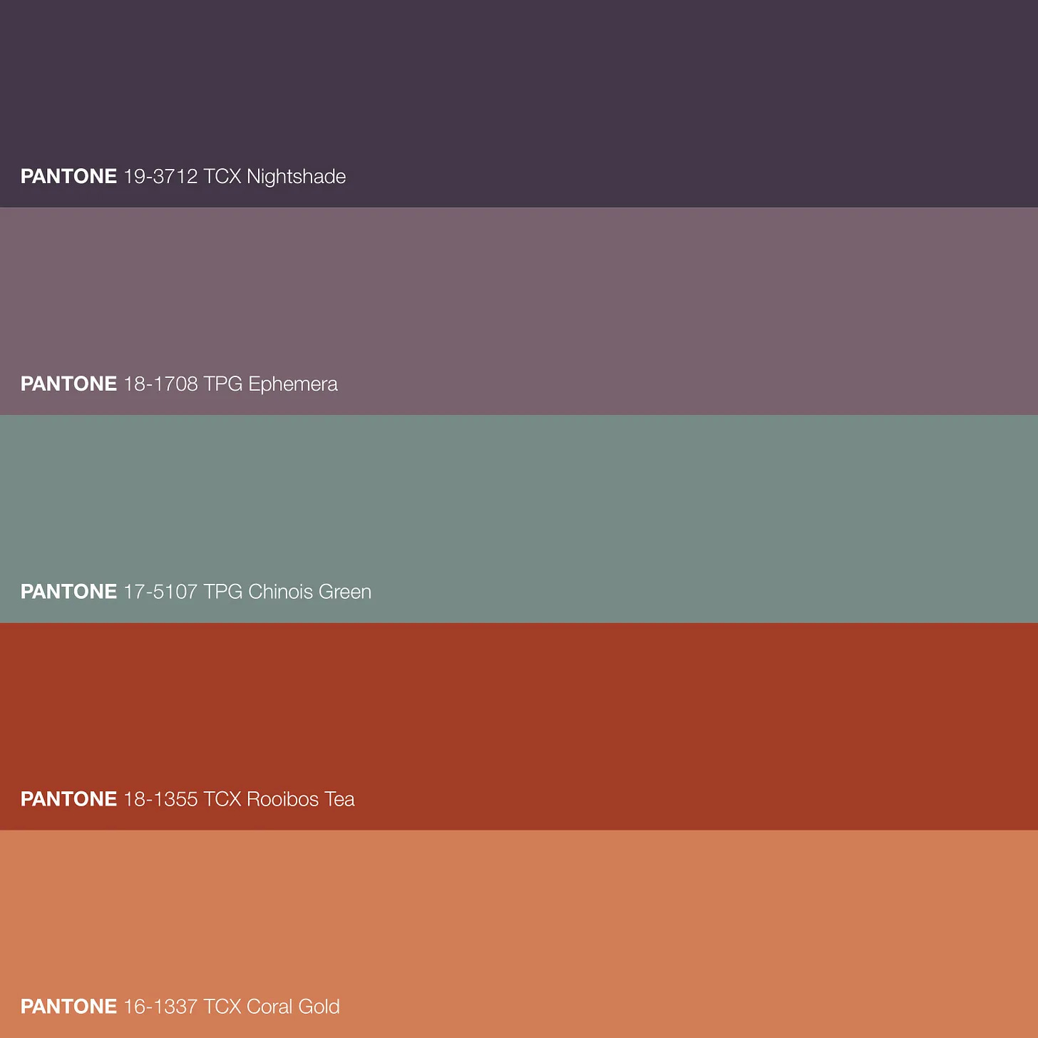
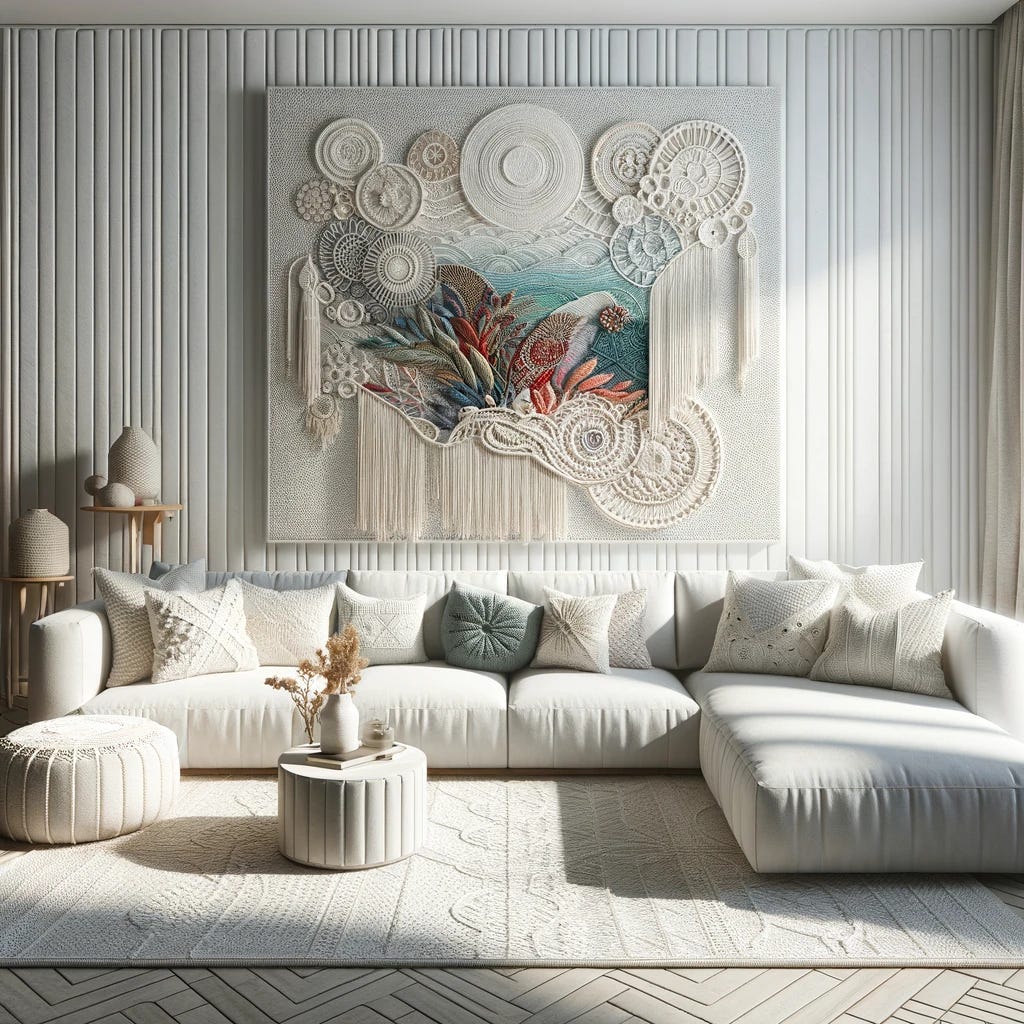
Here I’m sharing a simple demonstration of creating ten different colour palettes of different feeling and affect, all from one tapestry in a room that I created using AI (artificial intelligence):
TWENTY-NINE GOING ON THIRTY:


MERRILY MONIED:


HEAVY QUIET:


4.THICK PINK:


5.ALMOST LOUD:


BREEZY MORNING:


CLOUDY SUMMER:


LIBRARY AFTERNOON:


WARM BRILLIANCE:


INDECISION:


Wishing you a colourful rest of your day or eve!
-Vanessa :-)
I loved reading this, the colour combinations you picked out of the artwork are gorgeous.
Oh, I so enjoy this practice of pulling palettes from artwork and you are so right! It can open you up to options you might have never considered. I think my favorite palette here is "Too Loud". But they're all lovely options for any color lover to consider:)