040. Visiting San Francisco As A Colour Tourist
Returning to my former home city with eyes on its colours
Hello dear readers! I am back. It’s a delayed return due to my ongoing battle against winter germs - a fight I seem to be losing despite my best efforts, but I’m back nonetheless!
I have exciting news to share with you about my interior design activities for 2024 - more on that very soon! For now, I’m SO happy to be jumping back into a pool of colour with you! I’ve missed this!
Sometimes I am disappointed that all the colours I see can be categorised into only 11 distinct colours - black, grey, brown, white, red, pink, orange, yellow, green, blue, purple. And some languages have even fewer categories. I wonder what infrared or ultraviolet look like to eyes that can see them.
I used to date someone who was red-green colour blind. One night while looking in the bathroom mirror, out of the corner of his eye he saw a colour he had never seen before, just for a moment. I don’t think I’ve ever seen an adult as elated as he was when he burst out of the bathroom to tell me what had just happened. He literally wept with amazement, tears coming down his face as he tried to describe the colour he has just seen for the first time in his life - an experience that was already gone and unreachable just moments later.
Based on what he had read and heard about red, he thought that it must have been the colour he had seen. He hadn’t imagined a colour could be so vibrant and exciting. It was an intense experience even for me just listening to him, and it was perhaps the first time I really thought about the power of colour.
Most of us probably won’t have the experience of seeing a new colour (though who knows what the brave new future holds!), but we can play with the nuances of the thousands of tones, tints, and shades of the colours we do see. And we can experiment and observe the range of feelings evoked when different colours are put together into interesting combinations. I love this colour play!
My eyes were scanning for enticing colour combinations during my recent trip to San Francisco, California, one of my former home cities and one overflowing with natural and architectural beauty. Here are some of my favourite colour tourism photos from the visit, ENJOY!…
CASTRO RAINBOWS: Walking in my old neighbourhood of The Castro. Crosswalks celebrate its history as a LGBTQ+ hub. I love this muted take on a rainbow colour palette - it’s playful but in a relaxed non-Crayola way.

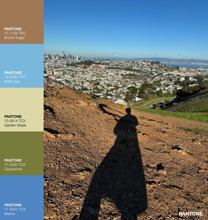
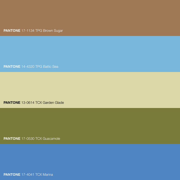
EARTHY BERNAL HEIGHTS: The view from Bernal Heights Hill is spectacular. From this spot I could see the Golden Gate Bridge, the Bay Bridge, and the San Mateo Bridge! The palette feels a bit desert-like to me, very connected to the earth.
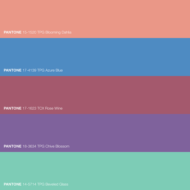
MISSION-Y NOE: This corner is on the diagonal slants between the neighbourhoods of The Mission and Noe Valley. It’s not fully one neighbourhood or the other, just like the blue-y purple and the blue-y green that start and end this lovely colour palette.
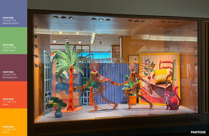
SFO HERMÈS STYLE: The San Francisco airport is a pleasant place to be. Good food, lots of convenient water bottle filling stations, and some great window displays - like this one from Hermès. I adore this colour palette I pulled out from the photo - it’s happy and energising yet still grounded by the clay colour, Rhododendron. This is my favourite colour palette of the trip.

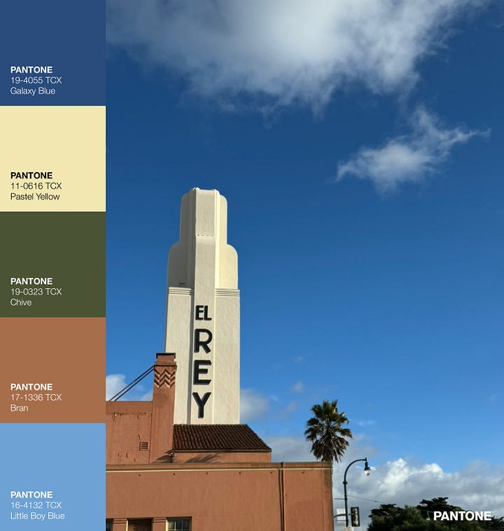
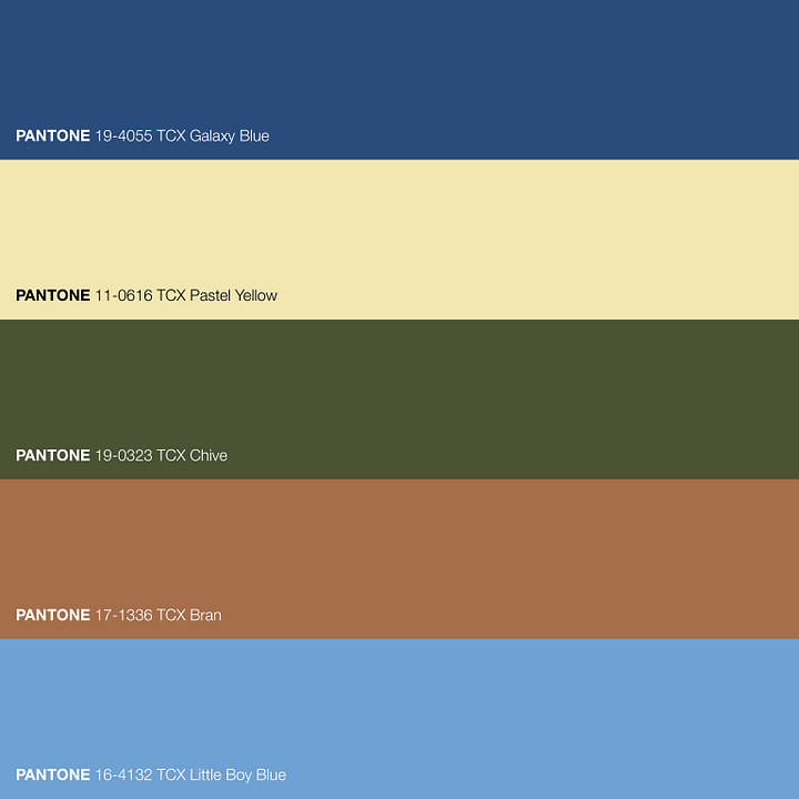
ART DECO CALI STYLE: El Rey Theater was built in 1931 and it still looks stylish, particularly against the beautiful blue Californian sky. I like the photo more than the colour palette in this instance.
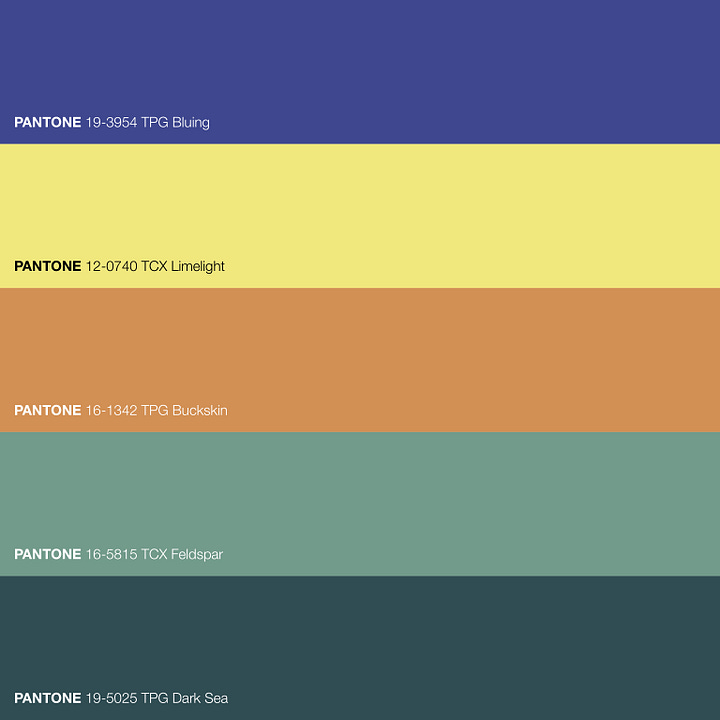
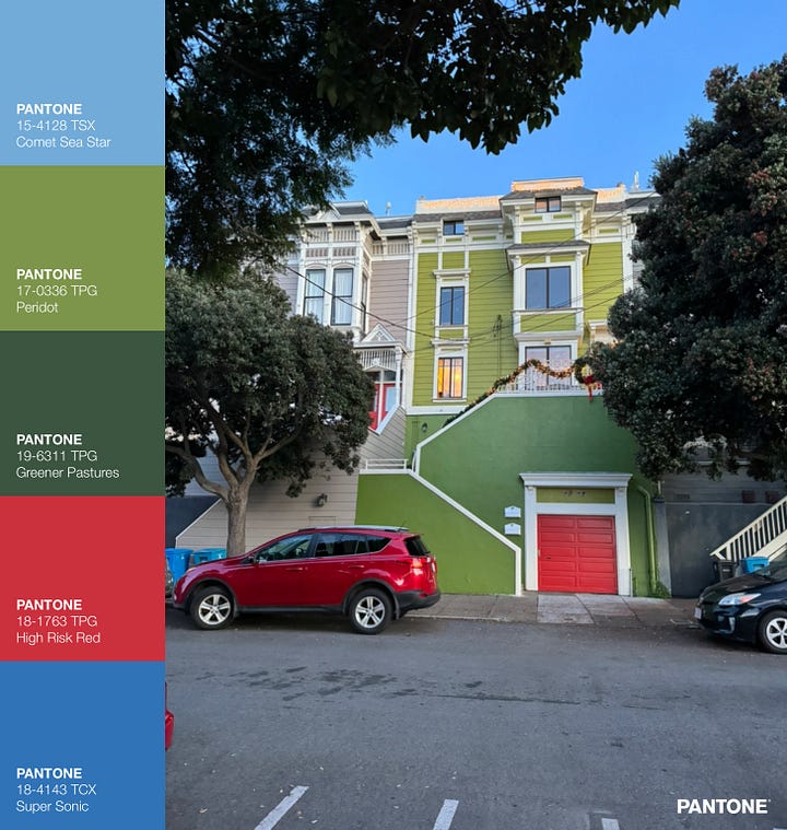
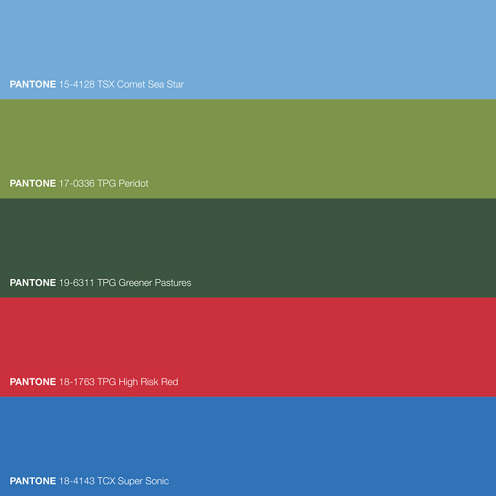
LOWER BERNAL JOY: I don’t know if the owner of the red car is the owner of this Bernal Heights house, but it’s nice to think so - and having it parked there certainly worked out well for my photograph! What a gloriously fun and playful colour scheme! Must be particularly great at Christmas time! A lime-green house? Yes, please!
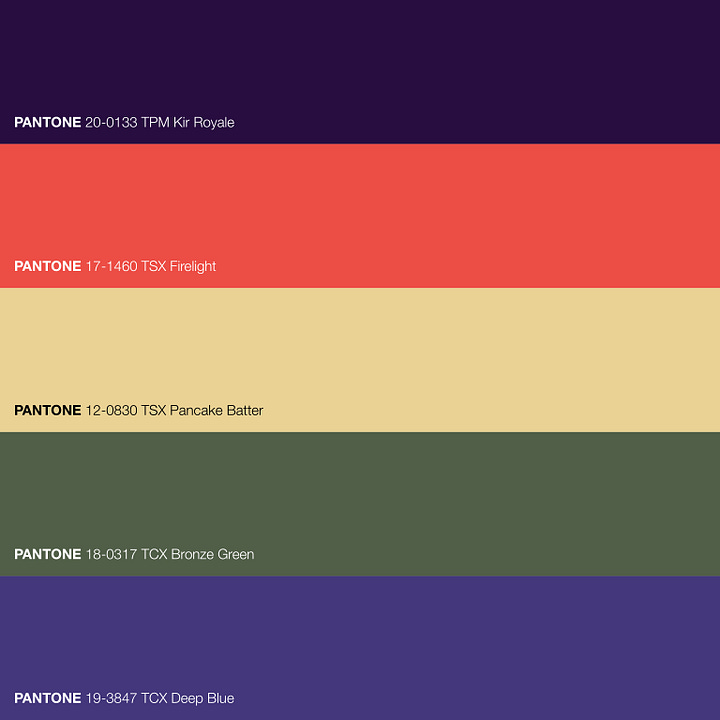
CORNONA HEIGHTS COTTAGE: The best neighbourhood in San Francisco according to me, a proud former resident! A hidden gem of a neighbourhood with endless treasures, including three enchanting staircases flanked with little residential beauties like this one. That gorgeous deep purple, Kir Royale, is pulled from the flowers in the foreground of the photo. I love it with the Firelight orange and Pancake Batter yellow. The more muted accents of the Bronze Green and Deep Blue give it a more adult vibe.

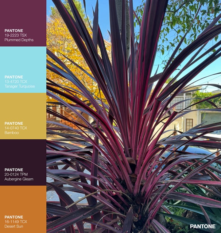
MISSION PLANTY PURPLE: Another fabulous purple combination, this time inspired from a plant (a Cordyline ‘Pink Passion’, I think) in the Mission neighbourhood. I’m super pleased with this colour combo - beautiful light and airy sky blue, grounded by the two mustards and the almost brown Aubergine Gleam.

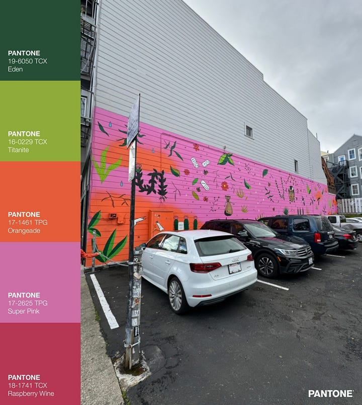
PINK PARTY PARKING LOT: A completely unnecessary and therefore all the more welcome burst of colour in an otherwise nondescript parking lot in the Mission.

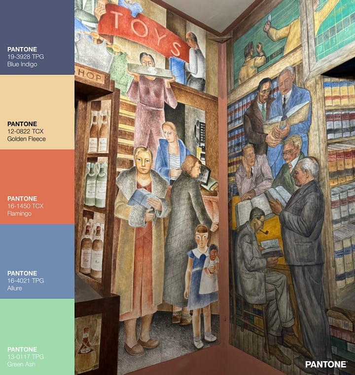
COIT TOWER MUTED MURALS: This is one of the many beautiful murals inside San Francisco’s Coit Tower. I somehow never managed to visit Coit Tower when I lived in the city, so I was very pleased to squeeze it in during a walk with a friend on this trip. The murals tell stories of California during the Great Depression of the 1930s. To my eyes, the turquoise Green Ash is the hero of this colour palette - it lightens the mood and saves the palette from being boring.

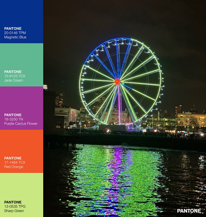
FISHERMAN’S WHARF FERRIS WHEEL: A view from the Sausalito ferry. Subtle is not what Fisherman’s Wharf is about, and its neon coloured ferris wheel makes that very clear! It’s tourist trap heaven, but worth a visit to see the resident sea lions! Even for me this colour palette is a bit much for a home, but it could be great as brand colours for the right product or service!

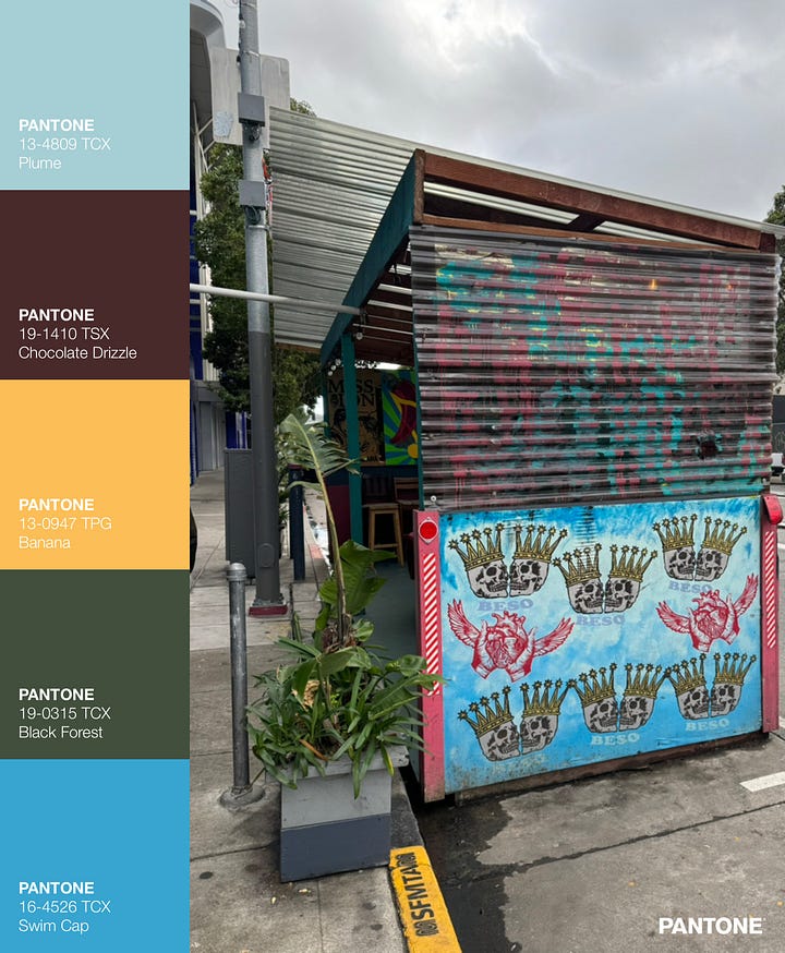
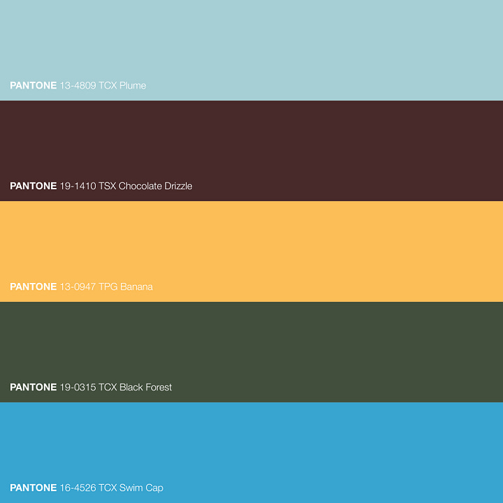
HIPSTER PARKLET: On Valencia Street, the epicenter of hipster heaven in the Mission. There used to be more parklets like this one, former parking spots reclaimed for outdoor seating. The city is apparently charging money for them now so they are fewer in number, but some fun ones still exist. This is a calm, cool and collected colour palette, confidently sophisticated.
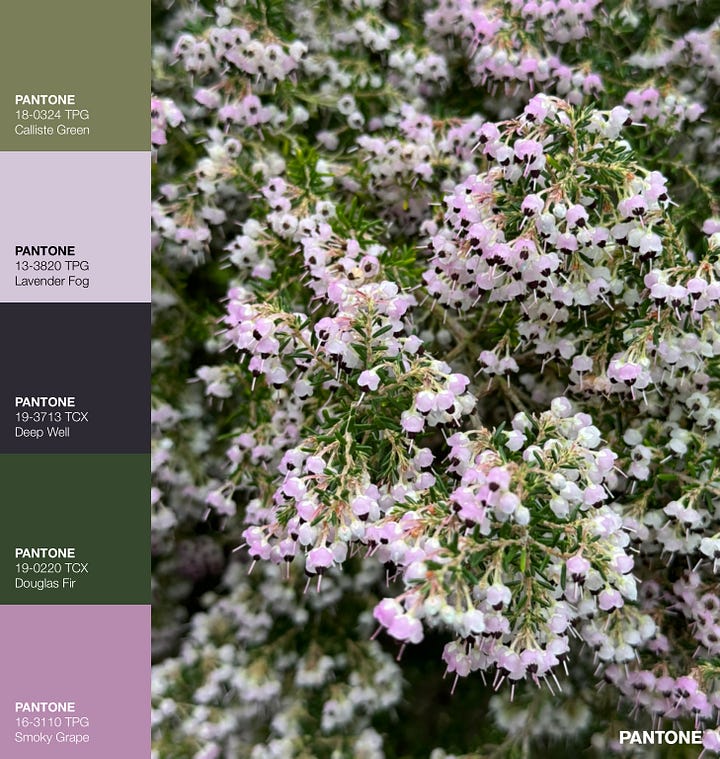
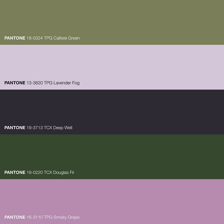
GOLDEN GATE HEATHER: During a leisurely stroll in Golden Gate Park, we spotted this pretty plant, a type of heather of the genus Erica according to my trusty PlantNet app. I try to avoid including greys or blacks in my colour schemes - grey because it’s my least favourite “colour” and black because it’s often too obvious a choice to be interesting - but here the Deep Well dark grey really felt necessary to prevent the colour scheme from being overly sweet.
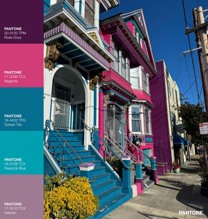
PROUDLY PINK: These beauties are in The Castro, the home of being unapologetically loud and proud! I very much appreciate the owner’s choice to put these colours on the exterior - it’s a wonderfully fun and playful choice. I wish more homes were painted with boldly unique colours loved by the owners. San Francisco does this well, as does New Orleans. Hmm, what other world cities or towns have lots of fun exterior colours on residential buildings?

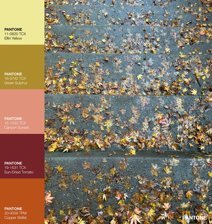
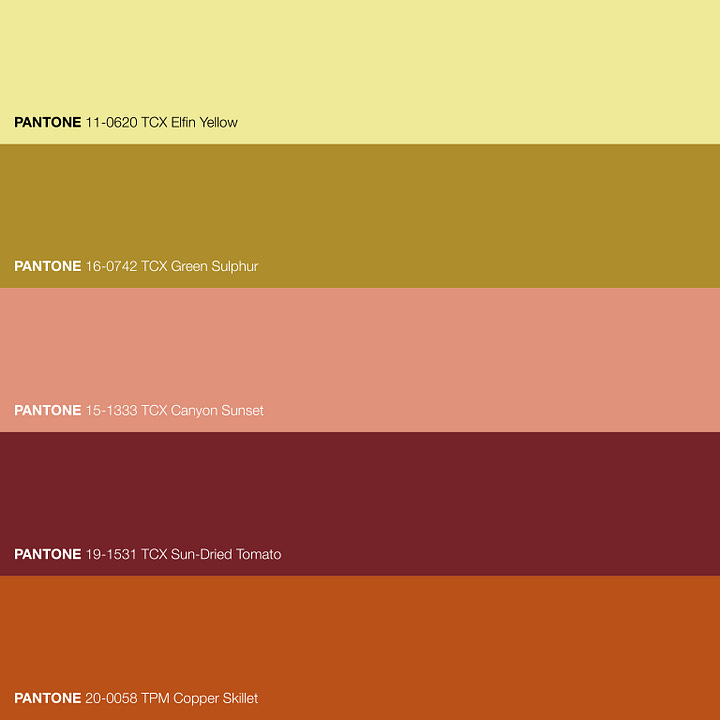
CRUSHED LEAF COSY: These little maple leaves looked so delightful to me, despite being wet and crushed underfoot. I like this version of an Autumnal colour palette - it’s a bit lighter and fresher than the classic look.
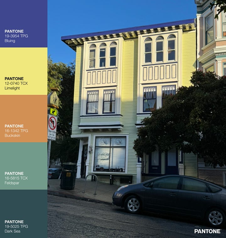
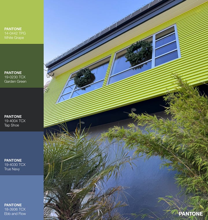
CORONA HEIGHTS COOL: That green! Lime green is one of those colours that I don’t tend to have in my home because it feels too cold, but I really appreciate looking at it in other people’s spaces. Combined with these more muted blues and green, the lime green provides an unexpected colour pop in a sleek masculine palette. I used to walk by this house often when I lived in the neighbourhood, and it always held my gaze.

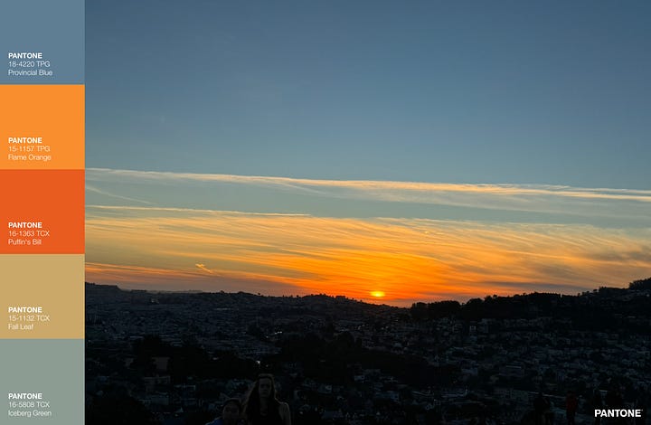
BERNAL HEIGHTS SUNSET: It was a lovely trip… family time, old friends, familiar places, and lots of gorgeous colour. This was the sunset from the top of Bernal Heights Hill on the first day of 2024, after a lovely day spent there with people we love. An auspicious start to the year…

Thank you for reading. Feels good to be back here. See you next week with my big news and fun AI-assisted interiors!
-Vanessa :-)


Beautiful, captures the spirit of SF. a city I love for the color. Great photos Vanessa!
A fascinating piece of colour research from a globe-trotting colour guru