


035. Befriending Greige
Can neutrals be interesting for a die-hard colour lover?

In my case, the short answer to that question is, “No, not really” :-). Neutrals are boring to my colour-hungry eyes. But, after exploring brown, beige and grey during the past few weeks, I do now appreciate these colours more than I did before, if only a bit!
Let’s have look…
I made these room images using AI.
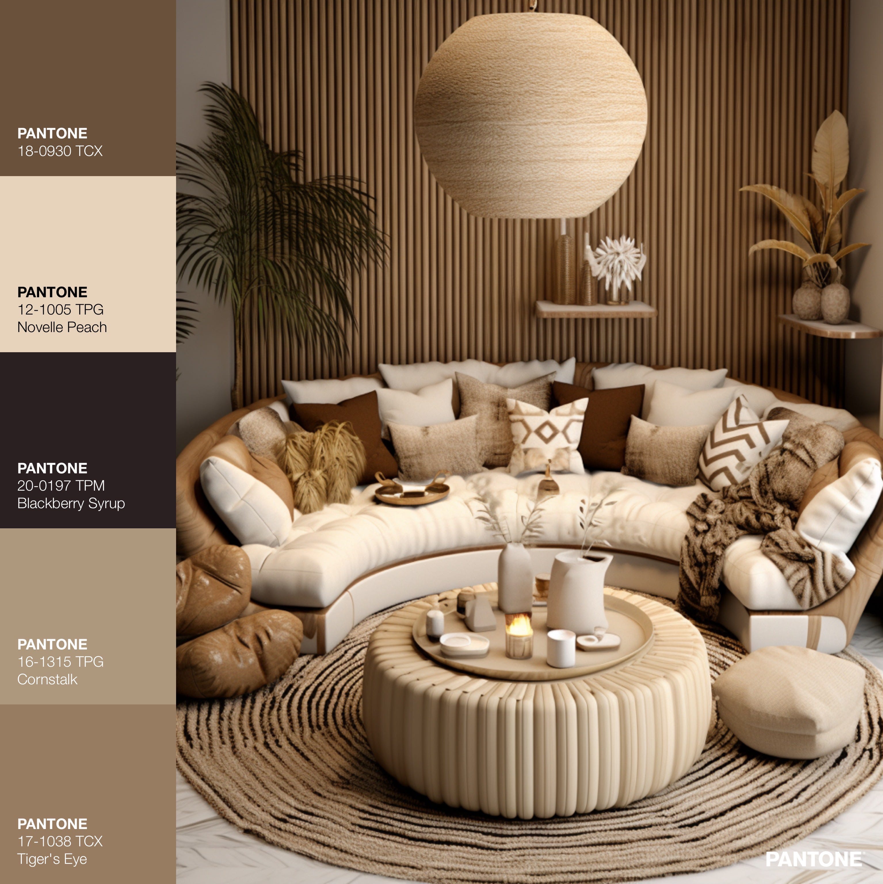
LAYERED PEACE: Layered texture is the key to making a room of neutrals feel interesting. This space does that well, with each surface offering its own textural personality. The variety of textures definitely adds to the interest and warm cosiness of a room. And while I can appreciate that this room may appear welcoming and relaxing to some, for me the lack of colour feels quite draining. Aesthetically I get it, but emotionally it doesn’t resonate with me.
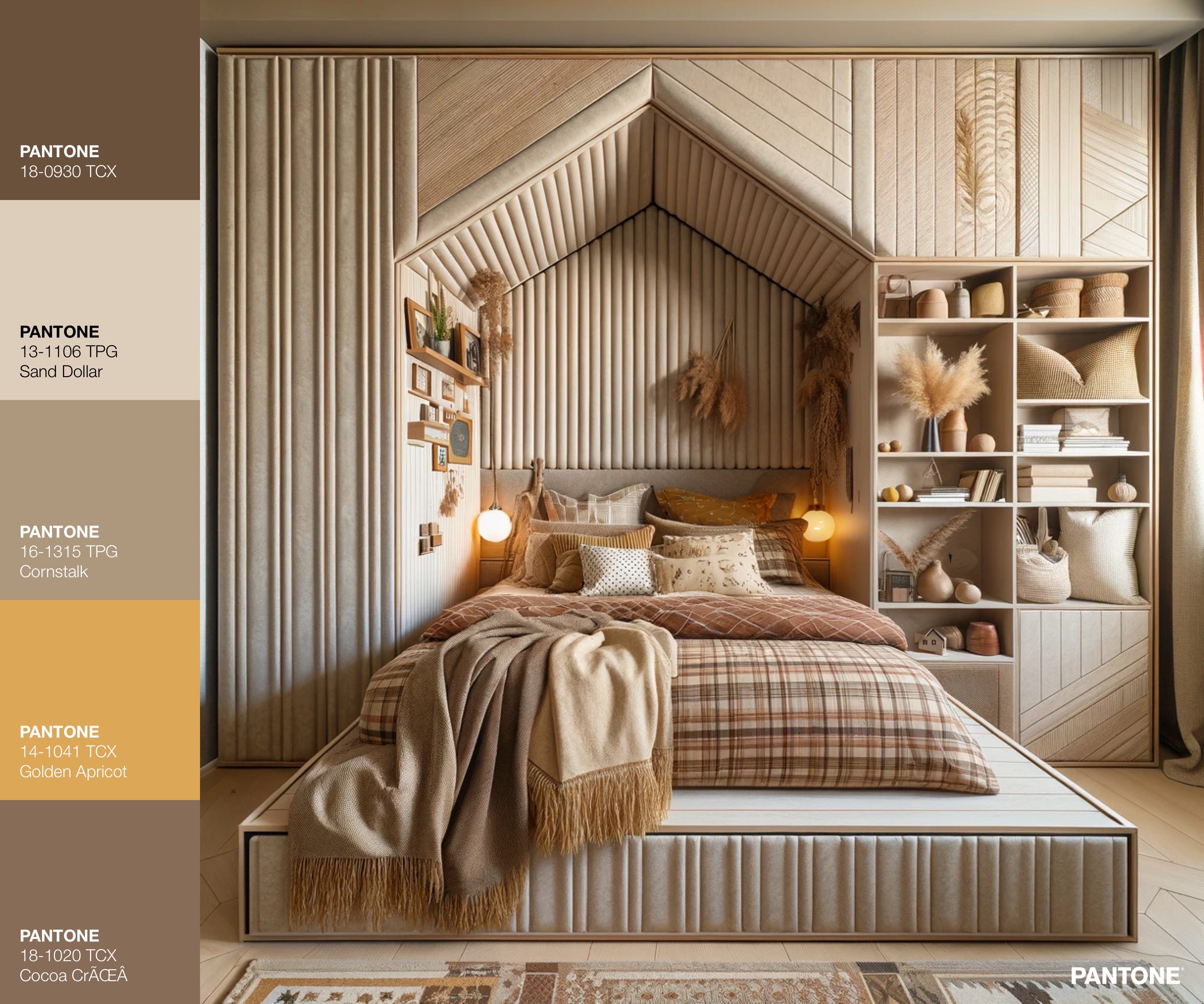
EASEFUL COMFORT: This bedroom is another example of a texture-heavy room of neutrals that manages to be soothing and cosy. There is almost a beachy relaxedness to the space. The raised built-in bed also really adds to a feeling of being enveloped in safe quiet, apart from the rest of the world. Again, while it is attractive, I think staying in this room for more than a few hours would make me anxious, with eyes hungry for colour.
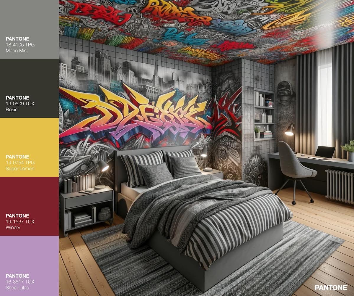
OH YEAH: Ta da!! This is the only room of this bunch that actually excites me. I love this room for a teenager or young adult. Granted it’s semi cheating to include it in this post because it’s not all grey, BUT, come one, an entirely grey room is a soul-sucking vortex of sadness.
This is grey doing what it does best - allowing unimportant aspects of the room to recede, in order for the real stars to shine. Coming up with this image was the first time I fully appreciated grey as a room colour. No other colour would be as successful a companion to the graffiti - including white or black because the high contrast they provide would steal attention from the graffiti. So, who knew… even mousy-grey can have a place in a colour-lovers home :-).
The colour palette I pulled out is here is also quite interesting I think. It’s not a combination of colours I have thought about before - Winery red, Super Lemon yellow, and Sheer Lilac purple… but they go rather nicely together, in an unexpected, slightly dissonant but satisfying way.
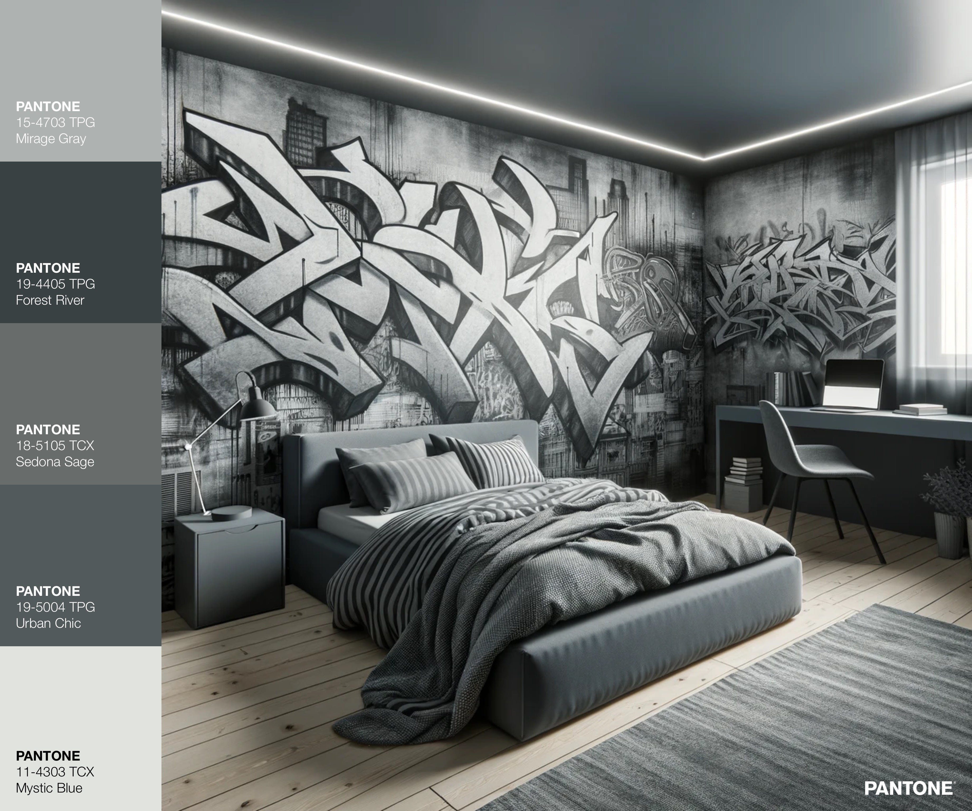
4. SOUL SUCKING: See what I mean? Here is a similar room but without the colour. Even with the high-energy graffiti, it literally looks like an evil overlord erased colour from the world while cackling maniacally. When I stare at this room, I actually feel like it’s getting harder for me to breathe. Colour - I need it!
FUN FACTS ABOUT BROWN & GREY:
While grey and brown are clearly not my go-to colours for interiors, brown does look stunning on human skin and grey hair is a beautiful celebration of a long string of lived moments.
I mentioned Angélica Dass a few months ago when I explored the colour peach, but her work definitely merits mentioning again.
The striking image below is from the Humanæ project, by the inspiring Brazilian artist, speaker, and educator, Angélica Dass. I encourage you to have a look.

Hope you enjoyed these!
-Vanessa :-)
I have recently befriended greige too. But as a more peppy neutral backdrop to a bolder interior. Not all greiges - esp paint - are created equal. Some are beautiful and others are just...flat. It's a hard shade to fangirl when you prefer a larger infusion of color though. So I understand:) 😉
I love the graffiti bedroom, I think any of my boys would have loved that. The pop of colour makes a huge difference ❤️