


029. 10 Shades of Green
Ten colour palettes celebrating green for home interiors

Green is, of course, the literal sign of life on our planet. Yet despite its inherently positive associations, I found green to be a hard colour to work with for my interior explorations. It’s a colour I haven’t explored much in my own life, and that was evident as I tried to create rooms that sang in notes of green.
Stumbling through green reminded me once again how glad I am to be doing this colour series, diving into colours one by one. Without forcing myself to examine all colours, it would be so easy to let blind spots remain. So, I plan to revisit green again in the future to deepen my understanding of the colour of life, but for now here are some rooms that celebrate it…
I created the images using Midjourney AI, Pantone’s Studio app, and in some cases Canva for editing.
LAYERED SENSUALITY: I love this room, despite the fact that dark green is FAR from my fav colour. In fact, it’s probably one of my least favourite colours. And this is a great lesson… In isolation, colours evoke quite a lot opinion from people. But when put in a scene along with other colours, contextualised in shape and place, colours that we thought we knew our own stance on, become an entirely different entity.
The unexpected bookends on this room - the Cloud Pink rug and Fir Green ceiling - transform what would otherwise be a boring room into a welcoming space that makes me smile.

HOPEFUL QUIET: The dark green wall feels like a blanket over the noise of the world and this space is deeply calming to me - but only because the lighter colours give a dash of hopeful happy to balance out the sombre wall. To me the room says, ‘Let’s meditate together and then go play in the rain!’

FOREST REPOSE: A room that smells like pine cones. In a mountain home with coyotes howling outside, this is a place to unplug, unwind, and smell the earth. This is another great example of how drastically the shape and forms of a room can change our perception of colour. Looking at the colour palette on the left in isolation, one might expect to see a catalog of military uniforms, rather than a refuge of cosy comfort.

GLAMOUR GREEN: Another side of green, this one requiring a cocktail on-the-rocks in hand. Unashamedly shiny glam green - this is a fun take on the colour. In my own home I prefer my spaces to be a bit less overtly showy, BUT I do appreciate the sentiment nonetheless :-)!

LUSH LUXURY: This colour palette is FABULOUS and is the definition of lush for me. Okay, the bathtub could be bigger… BUT I was purposefully exploring small-ish bathrooms to show that a luxurious feel can be achieved without palatial proportions. Here, that effect is all thanks to deep and rich jewel-tone tiles, brought to life by tall large-leafed plants. This look is now in the category of my future bathroom goals!

BOLD LIGHTNESS: The vertical subway tiles in this gorgeous colour, Fire Finch, is a simple device that gives such a striking effect, especially against the Treetop green. The floor is much more traditional and subdued than the walls, the combination of which gives a look that seems sophisticated and interesting. This is a bathroom to sing in!

STATMENT ROOM: This spaces feels very masculine to me and a bit overdone, but I love the combination of the dark cosy colours with the cold lime green. I have a newfound appreciation for lime green after this round of green colour exploration. It’s never been a colour I appreciated and certainly not a colour I would choose for a home, but I think I may have fallen in love with it recently!

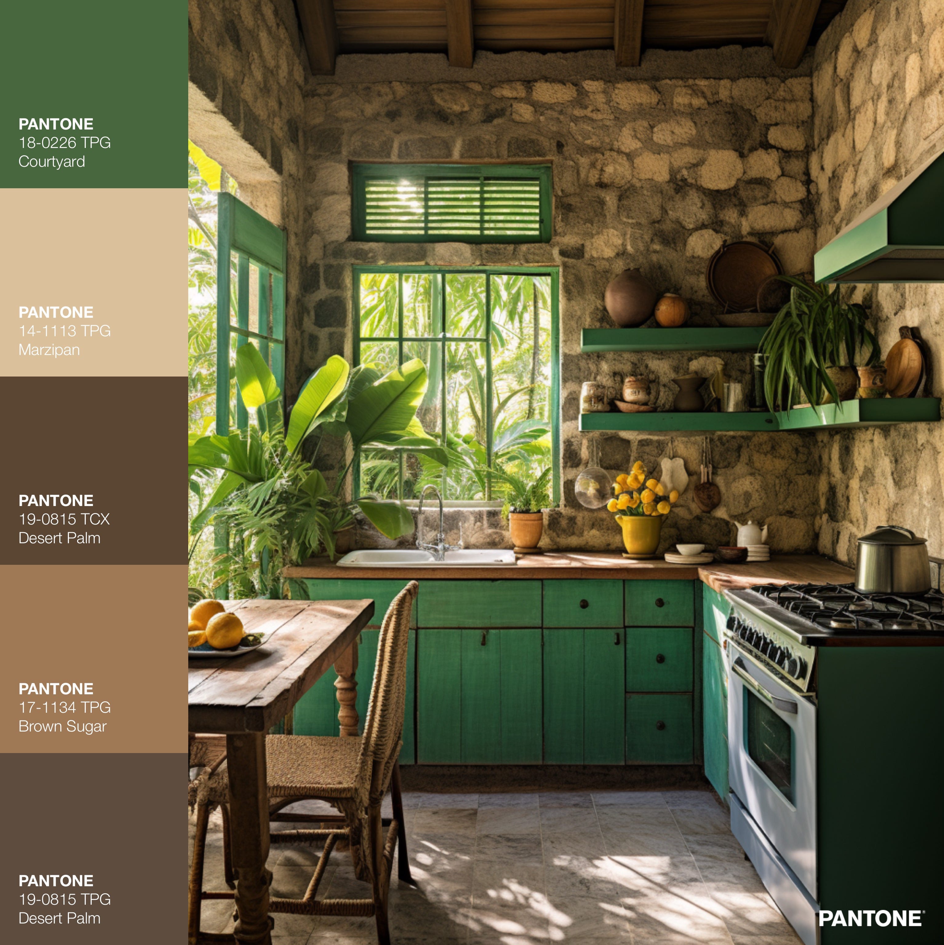
HONEST SIMPLICITY: One of my childhood houses had a wall made of stone just like this stone, and I always loved its look and feel. And while it isn’t necessary to go quite this rustic, I increasingly see the value of having natural irregular shapes and textures in a space. - It perhaps makes our reptilian brain feel more at peace, living in a home with elements of the millions of years of evolution spent living outdoors.
DESERT DANCING: This Orange Pepper colour is already WONDERFUL on it’s own, but it’s absolutely brilliant with the Pear Liqueur green and Rose Onyx purple. Definitely a colour combination that is WAY too much for some, but if you appreciate this flavour of bright and vibrant, like I do, then OOOOOOF this is just SO good!

SIMPLE GOODNESS: This is such a sweet honest little room. No pretense, so appropriate for a young child, so cosy-comfortable - I love it. Before these colour explorations, I never would had considered lime green as a wall colour, but here, I must say - it absolutely works!

FUN FACTS ABOUT GREEN:
In the 1800s in the UK, green was a popular and desirable colour. One shade of green in particular was extremely popular, Scheele’s Green, invented in 1774 by Swedish-German chemist Carl Wilhelm Scheele by mixing copper, oxygen, and arsenic. Another popular green, Emerald Green was also made using arsenic. These greens were used to dye an huge number of common items including wallpapers, toys, food, and clothing.
It is thought that many people in the UK during the 1800s became ill or died from arsenic poisoning from Scheele’s Green and Emerald Green. Though the dangers of arsenic were known to some extent at the time, it took many decades for arsenic green to stop being used. Even William Morris, famed designer (& poet, writer, artist, activist) used arsenic green in his wallpapers for a time, downplaying their negative health effects. In 1879, Queen Victoria had all green wallpaper removed from Buckingham Palace after a guest complained that it had made them ill. Here is a fun little animated webpage I found by Kate Oztas about the arsenic green.
It seems to be largely taken as fact that many people were poisoned by green wallpaper and other household goods in 19th century Britain. However, I also found a scientific paper that refutes the possibility of wallpapers causing widespread illness and death. So, poisonous green - fact or fiction - I’m not sure!

Thanks for reading!
-Vanessa :-)
I just found your account through The Great Indoors podcast and absolutely love all your articles. Will be devouring them! 😊