


023. Pink Gets Serious in 5 Rooms
Pink doesn’t have to be playful.

Pink as a colour struggles to be taken seriously. This is of course directly linked to strong and sustained industry decisions to use pink almost exclusively for products marketed for girls during the past century. Sadly, this strong association with the feminine has come to mean that pink is often viewed as a colour choice that is neither serious nor professional, and certainly not one that is readily chosen by most men in power - a disappointing but unsurprising commentary on the perceived power and status of women in the world.
However, pink is, of course, just a colour like any other. The femininity that society has imbued it with, originates from human brainwaves, rather than the light waves that are reflected back to us from pink surfaces.
I decided to explore creating images of home interiors that evoke an expanded range of emotions from pink. I have titled them with the feelings I sense when I view them, and I would be interested to hear from you the viewer what feelings these rooms communicate to you.
All images were made with Midjourney AI using my own text prompts, and the Pantone Studio App for the colour swatches.
SERENE SOPHISTICATION. Subtle shades of blush pink can be quietly chic, especially when combined with some ‘harder’ edges, like this leather headboard and copper patina wall.

SERENE SOPHISTICATION. Pink gets serious. EDUCATED CONFIDENCE. The chairs and sofa in this image are copies of the Eames Lounge Chair, a classic American design originally designed in the mid 1950’s by wife and husband design team, Ray and Charles Eames. Though it can be purchased in different colours, it is most often seen upholstered in black leather, pictured in neutrally coloured rooms with hard edges and a traditionally masculine feel. It is an expensive and sought after piece of furniture that has a decided no nonsense feel to it, in keeping with its mid-century origin. Using the Eames Lounge Chair shape but replacing black upholstery with pink, can trick our brains a bit into associating this pink furniture with feelings of distinguished elevation.

EDUCATED CONFIDENCE. Pink gets serious.


CULTURED ALOOFNESS. Thanks in part to the Barbie movie stardom, deep pink is enjoying a big moment in the spotlight. But deep pink is even harder to sell as a serious colour than lighter pinks. In the below living room, deep pink is paired with a deep yellow that Pantone amusingly calls Hot Spot. Hot Spot is also not colour typically associated with seriousness or responbiltiy, but it pairs well with the vibrancy of this pink so that neither is left to sing too loudly on its own. To bring in the ‘serious’, the room has the stark grey severity of the wall and coffee table. It’s rare that I would champion grey, but in this room I think grey is very successful at helping pink look like a perfectly respectable citizen of an adult space.

CULTURED ALOOFNESS. Pink gets serious. WELCOMING TRADITIONALIST. Leaning into deep and dark pink is a great choice for a cosy room where one can settle in with a warm drink and a good book or an intimate chat. This wall colour, Pantone’s Raspberry Radiance, exudes warm welcome. Though it’s not a colour that would occur to many to use liberally on walls, it’s an extremely inviting and comforting option. It’s darkness, paired with a plaid upholstered sofa in similar hues, give a reassuring sense of stability and tradition, without being boring or expected.

WELCOMING TRADITIONALIST. Pink gets serious. CLEAN SIMPLICITY. It’s so satisfying to shut down a clean kitchen at the end of the night, everything tucked neatly in it’s place behind a cabinet door. The muted shades of pink and green in this kitchen create a feeling of clean calm - a space to start the day fresh, and to end the day with quiet fulfillment.

CLEAN SIMPLICITY. Pink gets serious.


FUN FACT ABOUT PINK
In a ‘western world’ context, pink has been considered to be a girl’s colour for less than 100 years.
Previously, there was no widely accepted gender association with particular colours, and pink was sometimes even considered more appropriate for boys, being a tint of powerful red. All babies were often dressed in easily-bleached white gowns. Sometime about a hundred years ago, brands in the U.S. starting marketing clothes as colour coded for gender - but there wasn’t consensus on which colour was for which gender. By the 1940 and 1950s, however, retailers in the U.S. and Europe, were marketing pink toys and clothes specifically for girls.
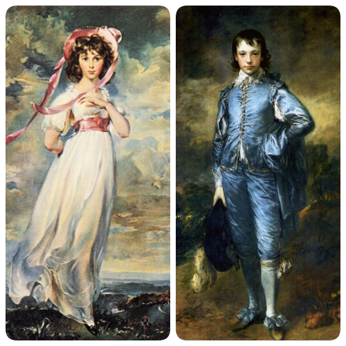
The exact origin of ‘pink is for girls’ is not entirely clear. Some articles point to a French practice of using pink ribbons for girls and blue for boys, referenced in Louisa May Alcott’s Little Women, published in 1868. Others cite the acquisition and public viewing of two unrelated paintings by American art collector Henry Huntington - one of a boy dressed in a blue suit and the other of a girl in pink and white. The paintings became something of a cultural phenomenon and they were reproduced many times, usually appearing as a pair, though they were painted by different artists more than 20 years apart and had no connection to each other.
Still other articles posit that pink became associated with girls after the inauguration of American president Dwight Eisenhower in 1953, when the new First Lady, Mamie Eisenhower wore a gown in her favourite colour pink and then went on to decorate many of the White House rooms in pink.
It was likely a confluence of factors that produced the strong association we now have with pink and femininity. And while the fact that femininity is often not viewed as serious as, or as strong as, masculinity is a deeper issue that will require much more work as a species, the connection between pink and femininity is an easier one break. ‘Pink is for girls’ has proven to be a trend with amazing staying power. It is a trend that has overstayed it’s welcome, is tired and anachronistic and one whose time is hopefully coming to a close, thus freeing pink to be just another colour.
Do you shy away from pink because of it’s cultural baggage? Do you use it in your home? - Would you like to?! Do you have interesting tidbits to share about gender associations of colours?
If you would like to see more rooms, in yellow and other colours, you can have a peek at my Practically Fabulous Instagram account.
-Vanessa :-)
Yeah, the gender bias of pink and blue carries intense emotions from the young ones I have worked with over the years. "Pink is for girls!" or "Girls can't wear blue," will invoke my obligatory four days in a row of wearing a variety of pink shirts. ;-) All snarky Barbie comments aside (I have nothing against snark!), pink has a permanent place in the interior design world.
Joined Substack just for this... 🥰