


024. Peach Adds Panache to 5 Home Interiors + the Politics of Colour Names
Peach leaves the 80s behind and embraces diversity

Peach is an odd kind of in-between colour that can easily slip into insipid overly sweetness. However, when paired with the right colours and patterns, one can almost forget that peach used to be a mainstay of the most boring and unimaginative kitchens of the 1980s and 90s!
Below are five rooms where peach shines. I made all the images using Midjourney artificial intelligence and the Pantone Studio App.
PEACH NEXT TO PATTERNS: My favourite use of peach is in unexpected colour and pattern combinations. I adore the bedroom below with its retro plaids and checks.

PEACH TROPICALE: Peach perhaps feels most at home in a tropical scheme, where it reminds me of eating a juicy papaya. The room below even has the black shiny seeds of the papaya in the floor tiles. It’s perfect for a hotel lobby. Peach lives happily with pink and white…throw in a little rattan furniture and I’m ready for my piña colada! (I was born and raised in the Caribbean, and piña coladas really were part of my world :-)).

PLAYFUL PEACH: I’m always looking for colours that will trick me into believing that cooking in a kitchen can actually be an enjoyable way to spend my time! This retro vibe is made light and quirky with the unexpected colour combination of pastel peach and lavender. Would it be enough to convince me that cooking is fun?… Probably not but it would be a fun place to have a tea and watch someone else cook for me.

PEACH MURALS: Textured walls are a unique way to make peach bold! This would obviously require a skilled artisan, but with the right hand, and a lot of plaster - peach can make QUITE the statement. Next to foam green and pastel blues this peach gives a beachy welcoming vibe and a great view while working at the desk.

PEACH GOES BOLD. This is about as far as one can get from the boring kitchens of the 90s! Not sure how well this look would play outside of a Miami-type location, but in the right setting, it oozes over-the-top cool. And I for one, am all for over-the-top! :-)

FUN FACT ABOUT PEACH
Many companies in the paint, beauty, and fashion industries have moved away from using the word ‘nude’ to describe a pale shade of peach. Only a fraction of the world’s people have this pale shade of peach as their skin colour.
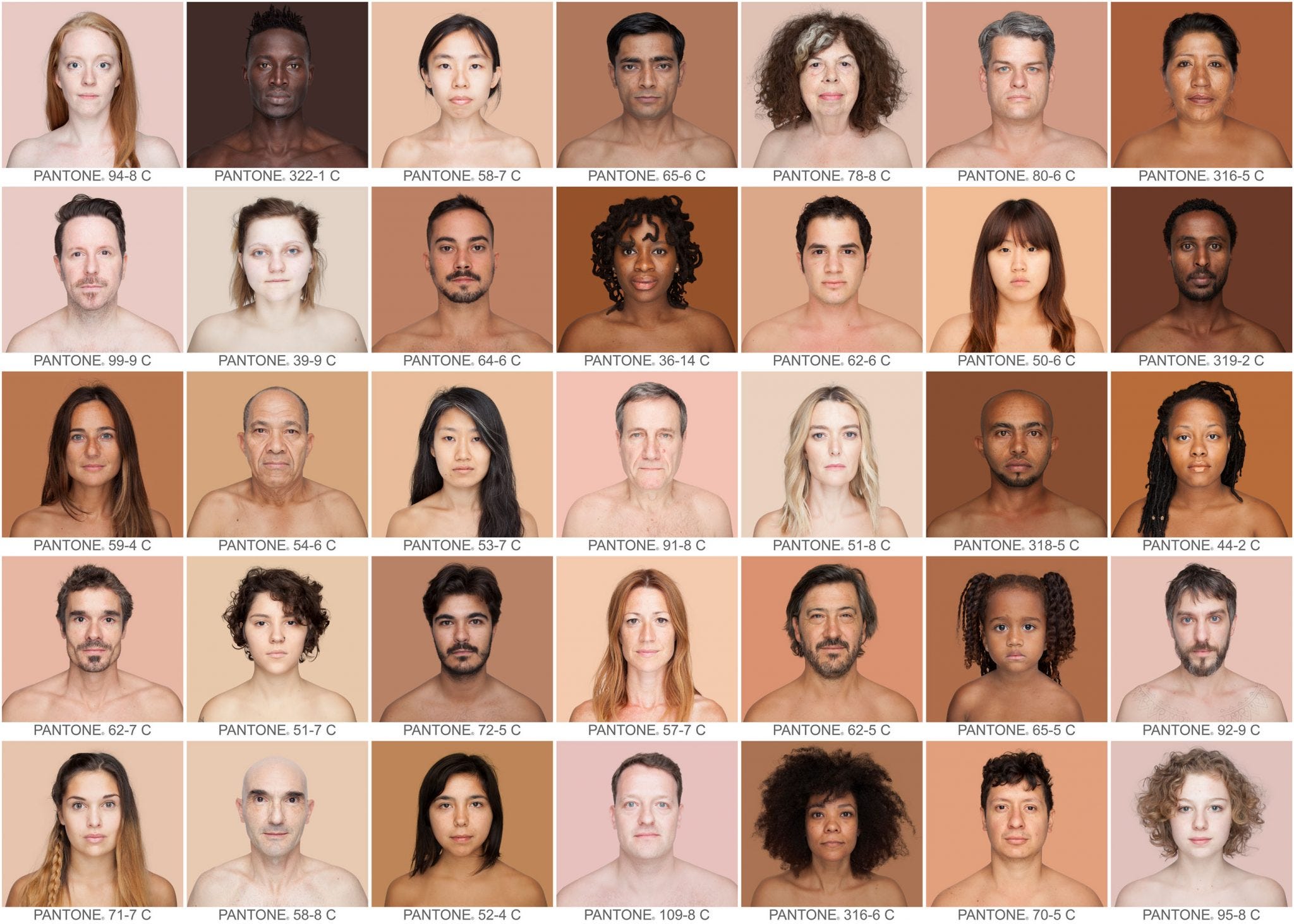
The striking image above is from the Humanæ project, by inspiring Brazilian artist, speaker, and educator, Angélica Dass. From her website:
“Humanæ is a photographic work in progress by artist Angélica Dass, an unusually direct reflection on the color of the skin, attempting to document humanity’s true colors rather than the untrue labels “white”, “red”, “black” and “yellow” associated with race.`It’s a project in constant evolution seeking to demonstrate that what defines the human being is its inescapable uniqueness and, therefore, its diversity. The background for each portrait is tinted with a color tone identical to a sample of 11 x 11 pixels taken from the nose of the subject and matched with the industrial pallet Pantone®, which, in its neutrality, calls into question the contradictions and stereotypes related to the race issue.”
Just a few months ago, on 31 May 2023, Pantone wrote a feature on it’s website, entitled “Redefining Nude”, in which they discuss renaming colour PANTONE 12-0911 from ‘Nude’ to ‘Peach Taffy’ as well as the addition of 28 shades to the 2023 Pantone® SkinTone™ Guide.
I’m the child of parents with very different skin colours that mean very different things in society. I’m the wife of a man with a skin colour different to my own. I’m the mother of a child with yet another skin tone. This work of Angélica Dass moves me.
In Angélica Dass’s words, originally spoken in Spanish to a group of students in Spain:
“No hablemos de diversidad porque hay que hablar de diversidad. Hablemos porque es de verdad lo que existe en la planeta que estamos viviendo y es lo que es la esencia de lo que es la especie humana.”
“Let's not talk about diversity because we have to talk about diversity. Let's talk because it is really what exists on the planet where we live and it is the essence of what the human species is.”
Thank you for your time and attention.
If you would like to see more rooms, in peach and other colours, you can have a peek at my Practically Fabulous Instagram account.
-Vanessa
Love the headline and the first sentence. Razor sharp writing! As for the designs, the red (lava) and peach is hard hitting--new to me and a nice change of pace. As long as the peach is not so saturated that it goes neon orange, I'm a fan!
What a beautiful design premise to look at all the beautiful 'nude' colors we have in the world. You're really taking color / design to a new level! Wouldn't it be interesting to use many kinds of nude on a wall representing people -- not sure where, a school? Home?