


025. Orange as an Option for Home Interiors
Loud and proud orange deserves a chance in our homes.

After two decades of having yellow as my first and favourite colour, red supplanted it as a more exciting and daring option for my 20-something brain. But red always felt like the too-obvious choice. Over time, my colour heart settled on a more nuanced shade, a red-y orange, that I still name as my official “favourite colour”, though years of living in the Netherlands have pulled my eyes towards the more orange side of red-y orange. The national colour, Dutch orange, is a particularly bright and confident, in-your-face version of the colour, without a hint of subtlety.
So today I share an unapologetic look at orange, in all its unnuanced glory. Not rust, not burnt orange or sienna… ORANGE. The first four rooms feature orange loud and proud, undiluted by its more socially acceptable cousin, brown. The fifth and final room showcases orange with an infusion of its energetic parent colour, red, resulting in my official favourite colour, red-y orange.
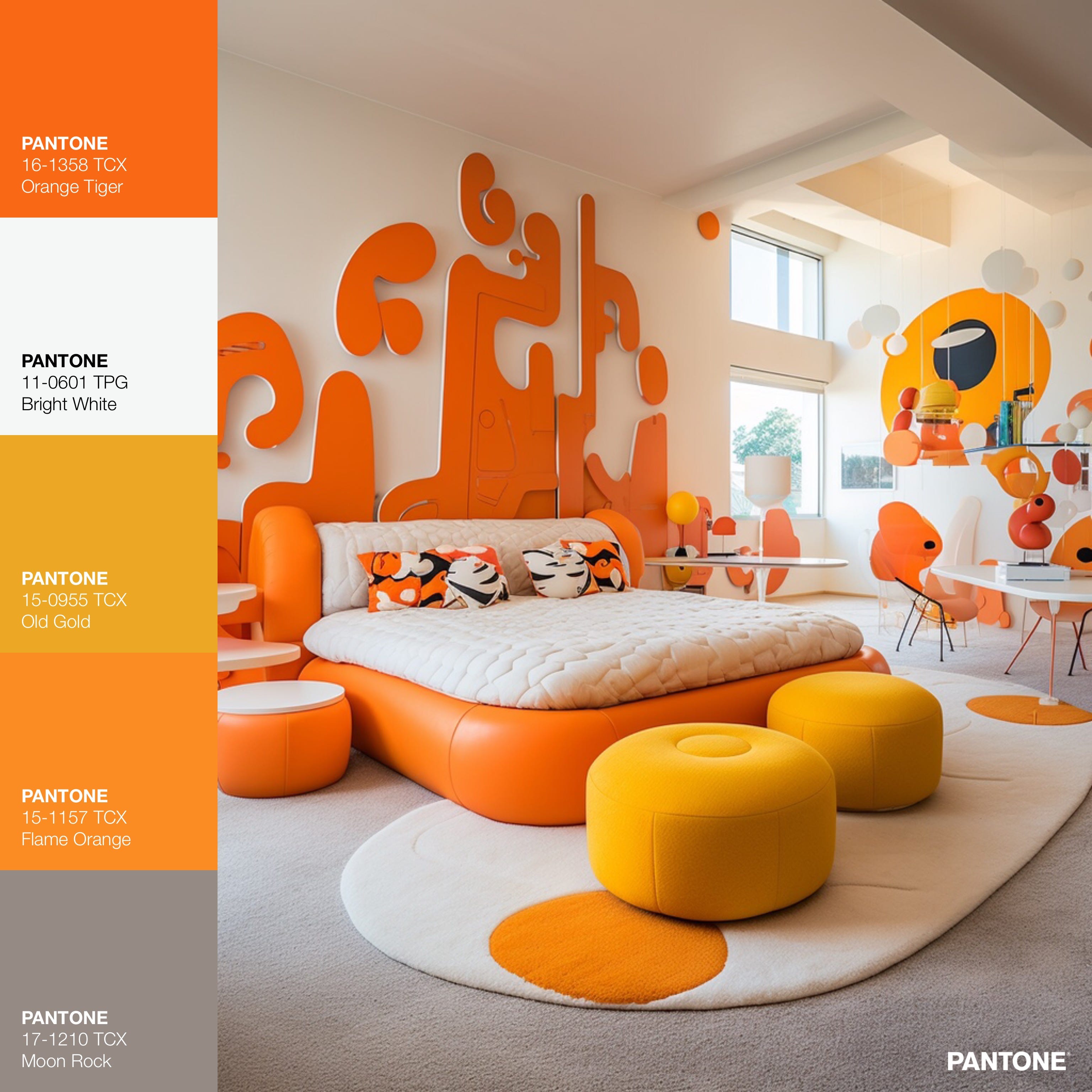
PLAYFUL GEOMETRY: Bright orange naturally feels playful to me. It’s perfect for this large quirky wall art that gives the room the “WOW” reaction that orange can easily elicit. People tend to have strong feelings about orange, so the WOW is sometimes ‘Wow, YES, PLEASE!’ and sometimes it’s ‘Wow, NO WAY!’. For me it’s almost always the former, obvs.
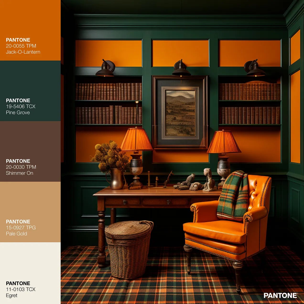
STUDIOUS PLAID: Patterned floors are my most recent ‘thing’, and I adore this one in orange and green plaid! A home office should be a delightful place to be, a place that motivates work without sacrificing comfort or humanity. Orange is a perfect colour for this as it is both energising and warm. I have really been enjoying using bold colour combinations, like this orange and green combo, in rooms where everything else is traditional in shape and style. It’s a nice juxtaposition… and it’s nice to be able to use the word ‘juxtaposition’ in a sentence ;-).
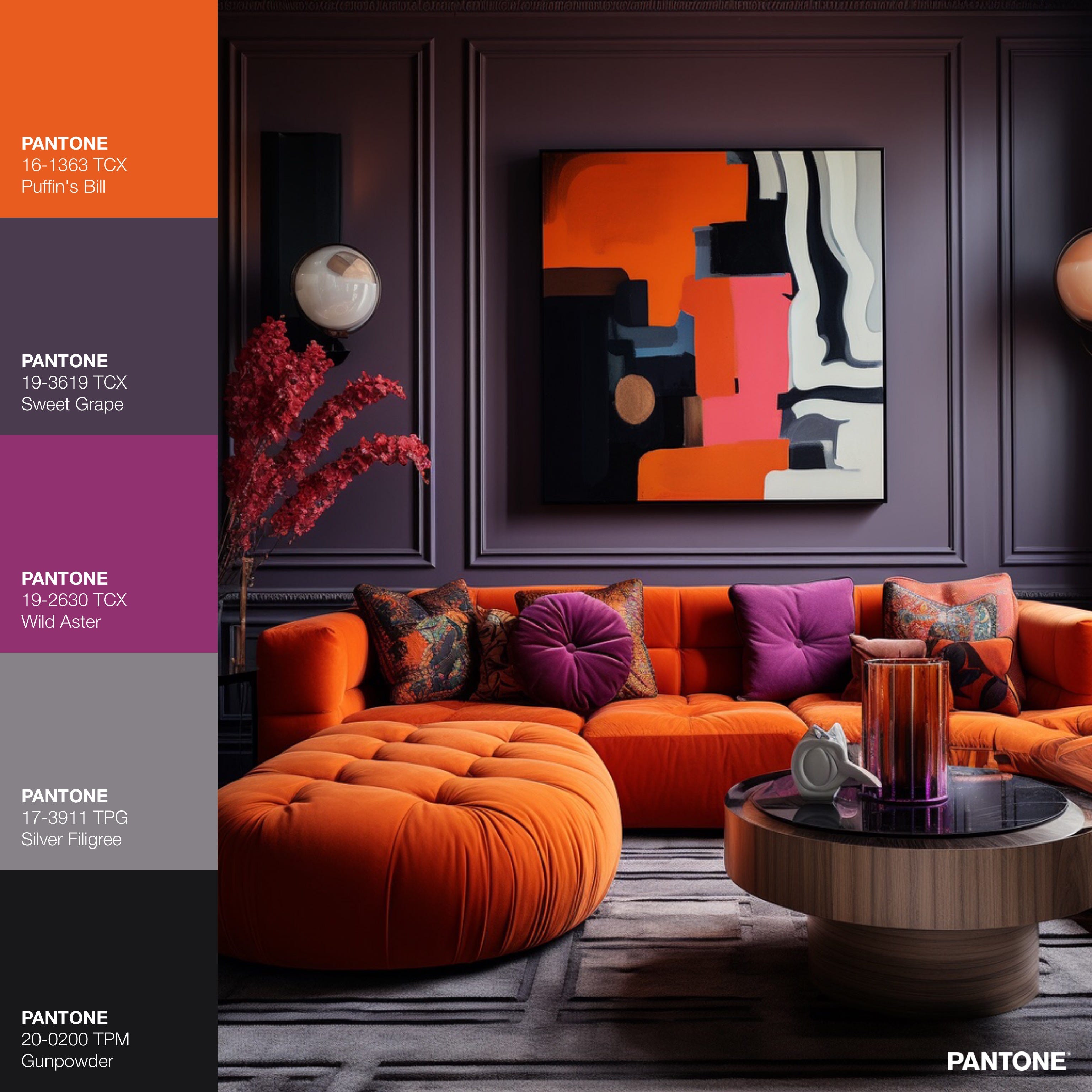
SULTRY URBAN - Similar to the combination of orange and green, orange with purple feels like a bold statement because of the high level of contrast and the relatively infrequent use of this combination for home interiors. I think this infrequency is unfortunate and should be rectified ;-). I titled this ‘sultry’ because of the curvy low-to-the-ground sofa, velvet fabrics, and that GORGEOUS shade of purple on the walls, Pantone’s Sweet Grape.
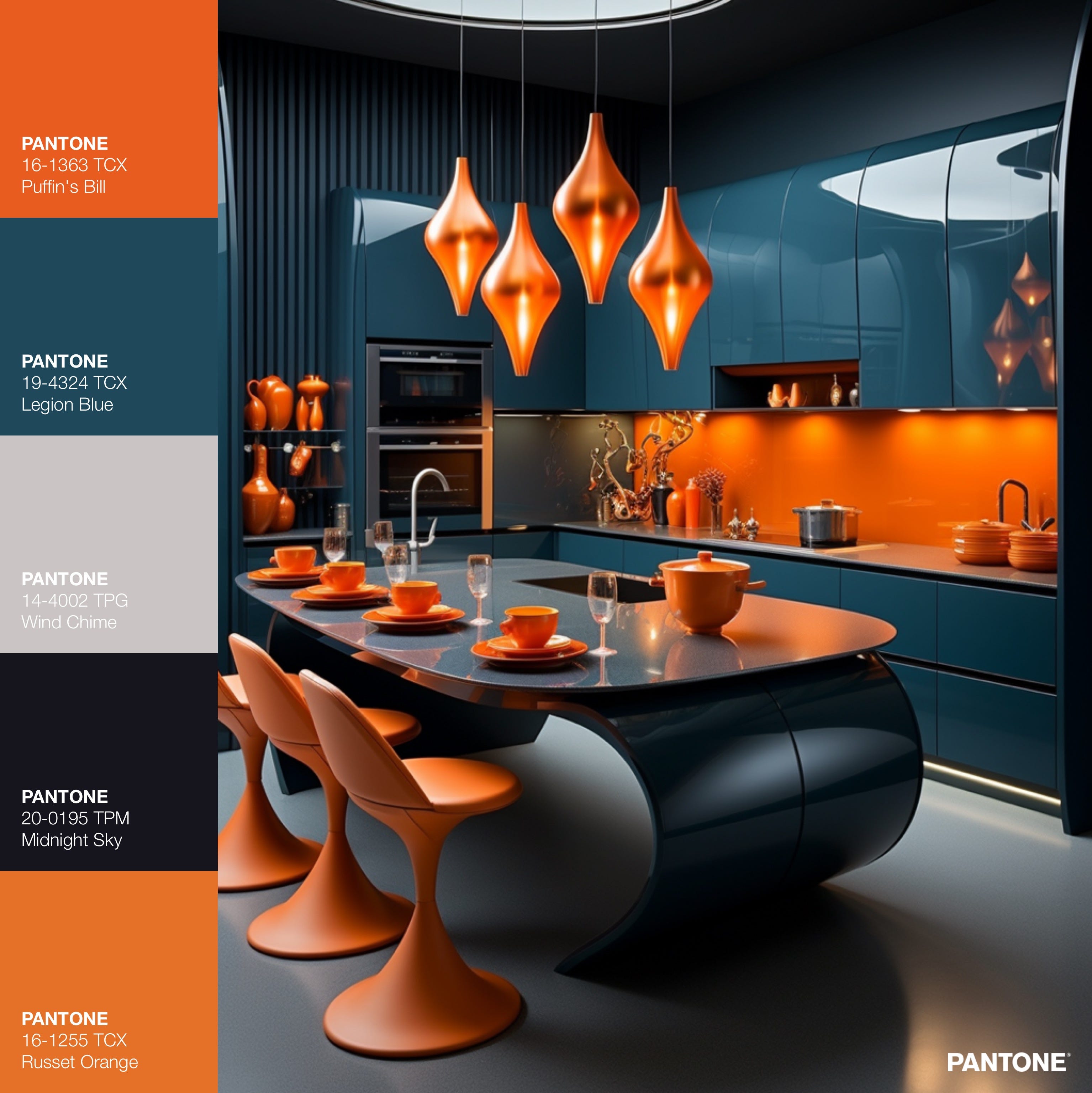
SEDATE LUXURY: Navy blue enjoys an extremely respectable reputation and few colours so consistently read as so responsible and stable. This splendid shade of navy, Pantone’s Legion Blue (SUCH a beautiful colour, say my eyes), manages to tone down even the brightest of oranges. The generous proportion of the kitchen island feels very luxe, yet its surprising curves along with the bold orange bring a definite pop of whimsy.
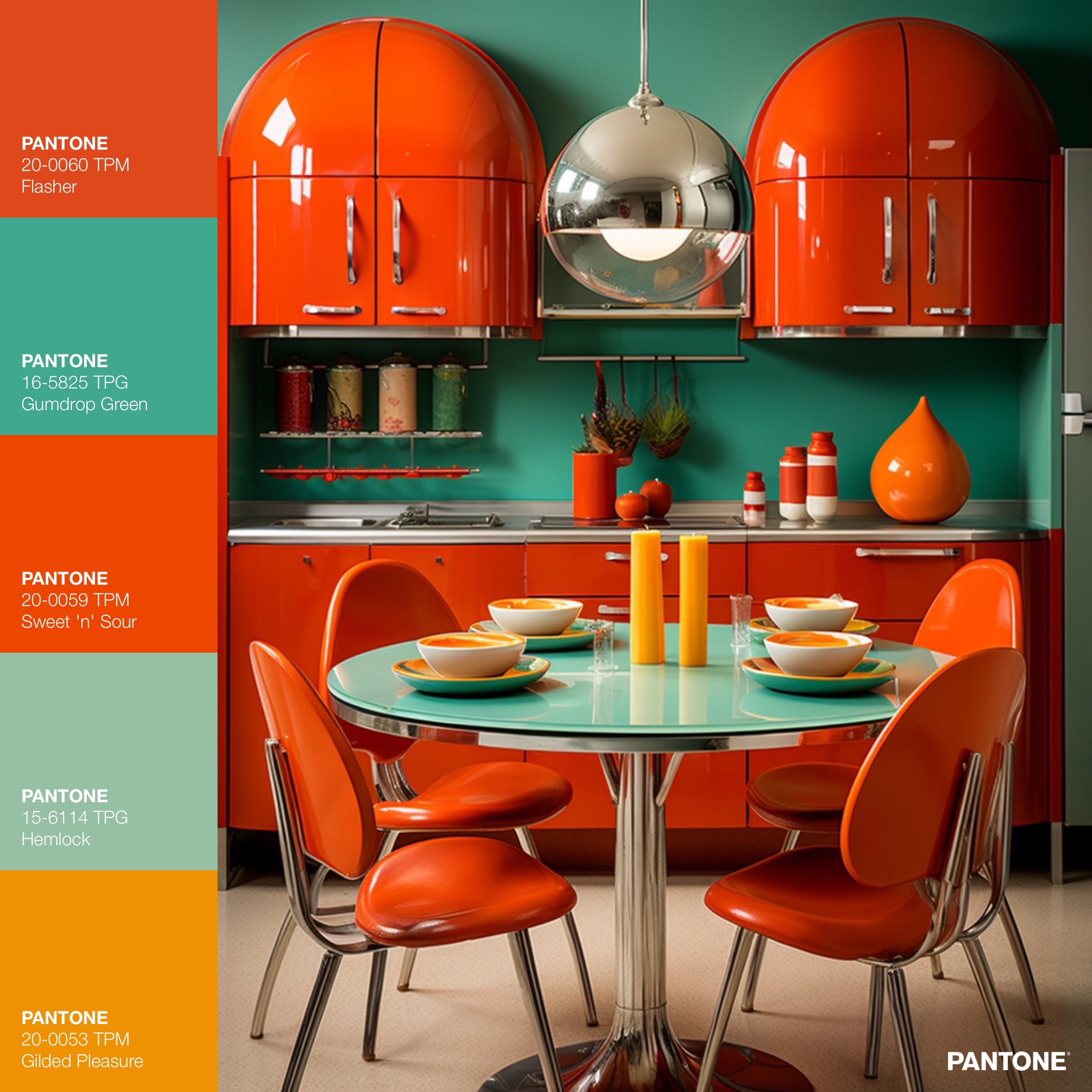
RETRO SHINE: Last but absolutely not least, in fact it’s my personal fav, the slightly nuanced red-y orange! Pantone’s Flasher looks even more resplendent on these ultra shiny cabinets. And putting it against the contrasting Gumdrop Green, from the opposite side of the colour wheel results in a room FULL of pop and verve! I love this kitchen!
FUN FACT ABOUT ORANGE
The famous orange colour of San Francisco’s Golden Gate Bridge was actually the colour of the primer that coated the steel components of the bridge. It was expected that the bridge would be painted black, grey, or silver, but the architect on the project was inspired by the orange colour of the primer and advocated keeping it. After extensive consultations by a multi-disciplinary team of professionals, they settled on keeping the colour of the primer, now called International Orange.

The Golden Gate Bridge Highway & Transportation District shares the formula for the now famous colour on it’s website, in case you would like to colour-match the orange of what is perhaps the most recognizable and most photographed bridge in the world, in your very own space!:
“Many people ask about the formula for the Bridge’s unique International Orange paint color. Paint stores can mix it with the following information:
CMYK colors are: C= Cyan: 0%, M =Magenta: 69%, Y =Yellow: 100%, K = Black: 6%”

Thank you for reading!
If you would like to see more rooms, in orange and other colours, you can have a peek at my Practically Fabulous Instagram account.
-Vanessa :-)
The colour exploration series:
I love how you used orange in widely different looking rooms which helps people understand that color can work in different ways depending on how its used.
Oh so beautiful! I love how the orange changes as you place it next to other colours! That retro kitchen at the end makes my eyes so happy! My sister’s childhood bedroom was in a muted version of those colours - brick orange walls and duck egg trim - I loved it so much!